
Project Goal
Create a photo competition microsite for participants to view contest details, submit photos and showcase winning entries.
My Tasks
UX/ UI Design,
Prototyping
Team & Roles
1 Product Manager
1 UX Designer,
1 Frontend Developer
1 Backend Developer
Duration
Research : 3 days
Design and Revision: 4 weeks
Development: 4 weeks
Oct 2019 - Dec 2019
The Problem
HDB wants to host a photo contest with Photonico, a photo marketplace under SPH, as part of their "Shapes of Home" campaign. The photo contest microsite nminimally needs to be able to explain the details of the competition, allow users to submit their entries, as well as showcase the winning entries at the end of the contest.
Research
Communicating with Product Manager
Exploring Photo Contest Sites
To understand what are the basic features required in a photo contest site, I looked up other photo contest sites such as iPhone Photography Award, National Geographic Photo Contest, and Nikon Photo Contest. I listed features that I felt would be applicable to our photo contest microsite and categorized them according to their importance.
Important Features
-
About
-
Entry Info
-
FAQ
-
Winners Gallery
-
Entry Submission
-
Contact Us
-
Prizes
Good-to-Have Features
-
Judges
-
Sample Gallery
In order to better understand what the clients wanted, I asked the Product Manager about the client's requirements, and went through with him my list of features which I had gathered. From there, I simplified and reorganized my list of features.
Important Features
-
Entry Info and Prizes
-
FAQ
-
Winners Gallery
-
Contact Us
Good-to-Have Features
-
Judges
-
About
Client's Request
-
Sample Gallery
-
Entry Submission
Communicating with Developers
I also gathered important data from the developers to better understand some of the back-end technologies that are being used and some of the limitations that will reflect in my design (e.g. the limit for photo size will influence my error message designs). I also evaluated each feature with them to understand the feasibility of each feature. Here is my final list of features which I chose to implement into the design.
Final List of Features
-
Entry Info and Prizes
-
FAQ
-
Sample Gallery (during competition) and Winner's Gallery (after competition)
-
Contact Us
-
Entry Submission
Ideation and Design
Initial Design Proposal and Wireframing
After confirming the features that will be included in the photo contest site, I designed some basic wireframes using Sketch. I wanted to create a design that was simple, intuitive, and informative,
First Iteration of Design Wireframes


Revisions and Simplification
I presented the several iterations of my initial wireframes to my product manager and the director.
Critique
-
Colors to dark and gloomy
-
Entry Info Page redundant
-
Too many Tabs
-
Dislike the use of graphics compared to real photos
-
Copy not inviting and friendly
Changes
-
Explored several different color schemes before deciding on Orange and White as the site's theme colors
-
Removed the Entry Info Page and moved the information to the homepage
-
Removed all graphics and changed them to real photos
-
Edited the copy to sound more impersonal
Revised Design Proposal
I implemented the changes to my design according to what was critiqued.


Revised Design Wireframes
Further Refinements and Mockups
I once again presented the design to my product manager, the director, as well as the client. Several refinements were made such as renaming of sections to be more inviting, redesigning the footer and the placement of links and buttons. I also started working on the visual aspect of the website in my mockups on Sketch.


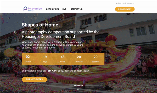
Refined Design Mockups
Prototypes and Mobile Web Design
I created prototypes of my design using InVision. I also started working on the mobile web mockups for the site.
Desktop Web Version Prototype


Mobile Web Version Mockups
Final Product
Final Design and Launch
Unfortunately, I was unable to launch the project before my internship had ended. However, I had completed most of the designing work. You can reach the final website here. The microsite received over 6,000 submissions between 1 September to 16 October 2020.
As I do not own a Macbook and hence do not have Sketch, I have since moved the mockup and prototype files into Figma for easier access. The prototype link can be accessed here. Do note that the prototype does not show the error messages, the winners gallery or the mobile web version as I have yet to make them into prototypes on Figma.
Learning Points
-
In this project, I learnt about the importance of space in design. Space not only allows designs to breathe, but it also allows designers to emphasize certain aspects of the design (e.g. a photo or an important info). By designing space in our project, we were able to increase readability (reduce cognitive load for users) and highlight specific sections/areas in the design (e.g. the entry info), hence enhancing the user experience.
-
Through this project, I also learnt about the importance of communication in a team. The start of this project was very rocky as members were not communicating with each other their expectations and needs. We had unclear objectives and did not know how to go about achieving them, which resulting in slow progress. However, this was quickly solved as members started to play more active roles in communicating with each other about the project. This built a good team culture within the team and increased the efficiency of the team. I am thankful for my team members and team leader, and hope to bring this positive team culture into every project I work in.