
Project Goal
Create an interface to replace a fitness trainer at home to aid fitness amateurs youths in their workouts.
My Tasks
User Research & Persona,
UX/ UI Design,
Low and High Fi Prototyping,
Rapid User Testing
Team & Roles
1 Producer,
1 UX Researcher,
1 UX Designer,
1 Visual Designer
Duration
Research and Ideation : 2 weeks
Prototyping and Testing: 3 Weeks
Product Presentation: 1 Week
Oct 2020 - Dec 2020
The Problem
Fitness amateurs lack the guidance on how to plan an appropriate workout routine, workout safely and track their progress, which in turn may lead to injuries and a lack of progress, motivation and results . They also lack the resources to engage a personal trainer as a solution to their challenges.
User Research
Defining the user
We conducted a semi-structured focus group over Zoom with 5 fitness amateur youths who do home workouts (aged between 18-35 years old) to understand their needs, lifestyle and behaviors.
Focus group allows fellow members to bounce ideas off each other, to challenge and respond to each other’s ideas, while the discussion is tightly directed to a select few themes and ideas by the moderator. Fitness amateurs have ideas and concerns but due to their lack of experience might not be able to properly articulate them on their own. In a group context, their responses can synergize as part of the joint construction of meaning. In addition, while amateurs have a broad variety of tactics and solutions they can think of, a focus group allows the moderators to pick out certain themes to narrow down the scope to help generate more specific design solutions.
1.
-
Users believe exercise is important and does so regularly
-
Inspired by social media or influenced by friends
2.
-
Have some experience using fitness apps but burned out quickly
-
Want to build sustainable routines
3.
-
Want to have a personal trainer, but too expensive
-
Look to online alternatives such as YouTube and blogs, but lack customizability

Persona Creation
Using the information collected, we were able to create a Persona, Keziah, to represent our target users.

Ideation and Design
Initial Design Proposal
Using our research findings, we started ideating potential solutions to our user's problems and evaluating the feasibility of each solution.


1.
Interconnected Fitness Experience
-
Integrate wearables to gather fitness information
-
An AI that uses fitness information and goals to tailor unique workouts that prevent burnout
2.
Motivation: Social Experience & Gamified Fitness
-
Enable collaboration and competition between friends to spur them to complete their fitness journey togethe
-
Allow users to post their fitness progress on the app
3.
Personal Fitness Trainers: Expensive Good-To-Have
-
Exciting to have an AI trainer to save on cost while ensuring efficient and safe workouts.
-
Might lack human touch
Storyboard
Using the persona that we have created, we created a storyboard to describe our user's experience with our product - Move Mirror 1.0.

Unboxing

Setting Up

AI Fitness Trainer
Unboxing
Prototyping and Testing
Mid-Fidelity Prototype
We used Proto.io to create mid-fi prototypes in preparation for our user testing.
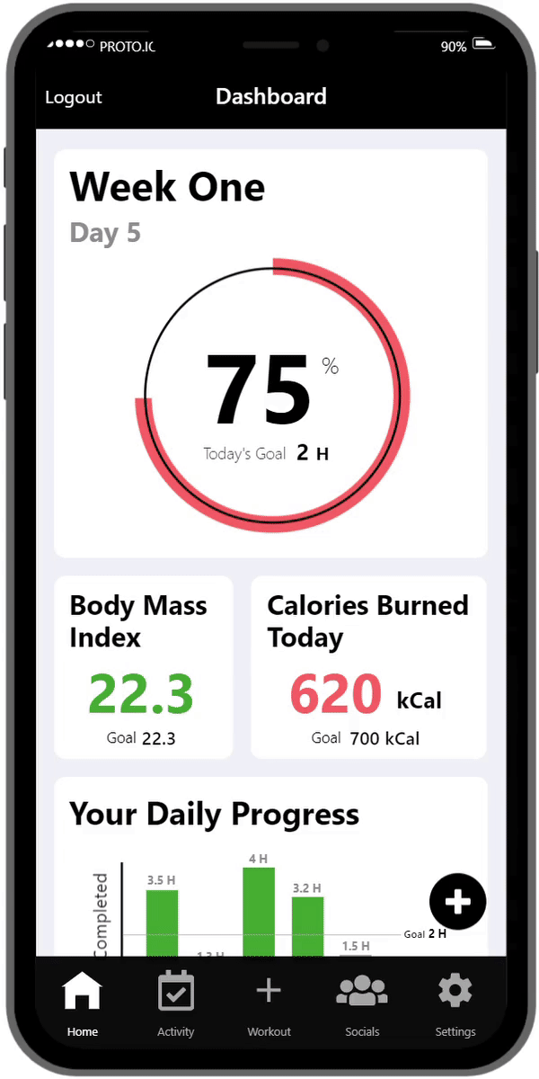
GIF1.1 Move Mirror Smartphone App
Internal Pilot User Testing
We went on to do an internal pilot testing to try out the mid-fi prototype to ensure there are no errors. We made used of physical tools and roleplay to simulate the smart mirror and the AI functionalities. We used the pilot testing as an opportunity to modify parts of the product experience we found to be awkward.
High-Fidelity Prototype
After the pilot testing, we continued to refine the existing smartphone app, and further designed a smart mirror and smart watch to provide a more comprehensive and realistic experience
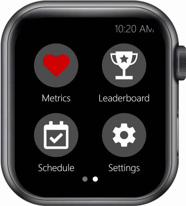
GIF1.2 Move Mirror Apple Watch App
GIF1.3 Move Mirror Smart Mirror
User Testing Results
After refining all the prototypes, we invited the same 5 participants from our interview to test out prototype.
Feedback
Participants' Quotes
-
"If the mirror is too far you cannot really see what you are doing"
-
"In order to see yourself, you’ll need to be pretty far from the mirror"
-
"Why are there controls on both the smartwatch and phone? What controls what? Are there speakers on the mirror?"
1.
-
Users all expressed they would be very willing to use the product both privately and publicly - High social acceptibility
-
Product seen as "cool" and "high-tech"
2.
-
Original size of the mirror highlighted by many participants as too small
-
Concerns that participants have to stand far away in order to fully see themselves in the mirror
3.
-
Users were unclear where the audio was coming from - the smartphone app or the mirror.
4.
-
Users wanted key metrics to be included in the app for evaluating progress.
-
Users also wanted a dashboard so that they can see their daily progress
5.
-
Mixed reactions from users about the social media feed
-
Some felt that posting fitness progress was inspiring and encouraging while others thought it encouraged toxic positivity
6.
-
Users suggested features that they hope can be implemented such as collaboration - "working out together", and diet recommendations
Revisions and Improvements
Taking into account the feedback of participants with respect to point 2, 3,4, 5, and 6, we made revisions to our app accordingly:
2.
-
Increased the size of the mirror while retaining its portability through the use of a foldable 2 x 3 15 inch mirror.
4.
-
Build a dashboard with cards to depict different metrics to showcase user's progress
-
Designed to be glanceable
-
Included more commonly used metrics for users to track their fitness progress
6.
-
We didn't include the suggested features in Move Mirror 1.0 as it requires more research and design. As such, we hope to bring it into Move Mirror 2.0.
3.
-
Clarified that the audio came from the smartphone/earbuds
-
Changed all volume controls from "Mirror Volume" to "Workout Volume"
5.
-
Moved the social feed to a less noticeable area on the app so that users still have the affordance to post their progress if they want to.
-
Removed likes to remove social comparison among users
Product Presentation
Final Design Proposal
After further modifications and refinement, we produced a video to highlight how the three interfaces work together both in sync while also complementing each other.
I received an 'A' grade for this module.
Learning Points
-
User testing, user testing and user testing again. Our user testing from both iterations (both the pilot and actual user tests) revealed critical insights into how users actually feel and react to our product. These user tests not only allows us to identify possible pain points in our design, but also validates that our design solution truly solved our design problem.
-
Details, details and more details. We found that although the main design of our prototype was well-done, we had neglected the small details of the app experience such as the placement of buttons, copy and error messages. As such, it resulted in many contradictions in our design, which significantly impeded user flow. We had fixed these details in the later phases of our design, which took up a lot of our time and effort.